Logos & Marks
Cannon
Overview
To commemorate Cannon’s 130th anniversary, six distinctive logo/brandmarks were created as part of an identity system celebrating the brand’s legacy and highlighting its product features. Each logo reflects a unique aspect of Cannon’s commitment to quality, innovation, and customer satisfaction while reinforcing its position as a trusted leader in home textiles.
130th Anniversary
This signature logo celebrates Cannon’s 130 years of craftsmanship, innovation, and customer trust, tying the collection together. It honors the brand's rich history while highlighting its continued relevance and innovation in home textiles.
Tried, Tested & Loved
This logo symbolizes Cannon’s enduring legacy of excellence. Representing decades of trust and reliability, it pays homage to the countless homes where Cannon products have been cherished, underscoring their proven quality and customer loyalty.
Heart of the Celebrations
This celebratory logo represents Cannon’s role in life’s special moments, from festive occasions to quiet family gatherings. It reflects the brand’s ability to make everyday moments extraordinary with its versatile and stylish offerings.
Rooms
Focused on versatility and diversity, this brandmark highlights Cannon’s comprehensive range of products for every room in the house. From the bedroom to the bathroom, Cannon transforms spaces into comfortable sanctuaries.
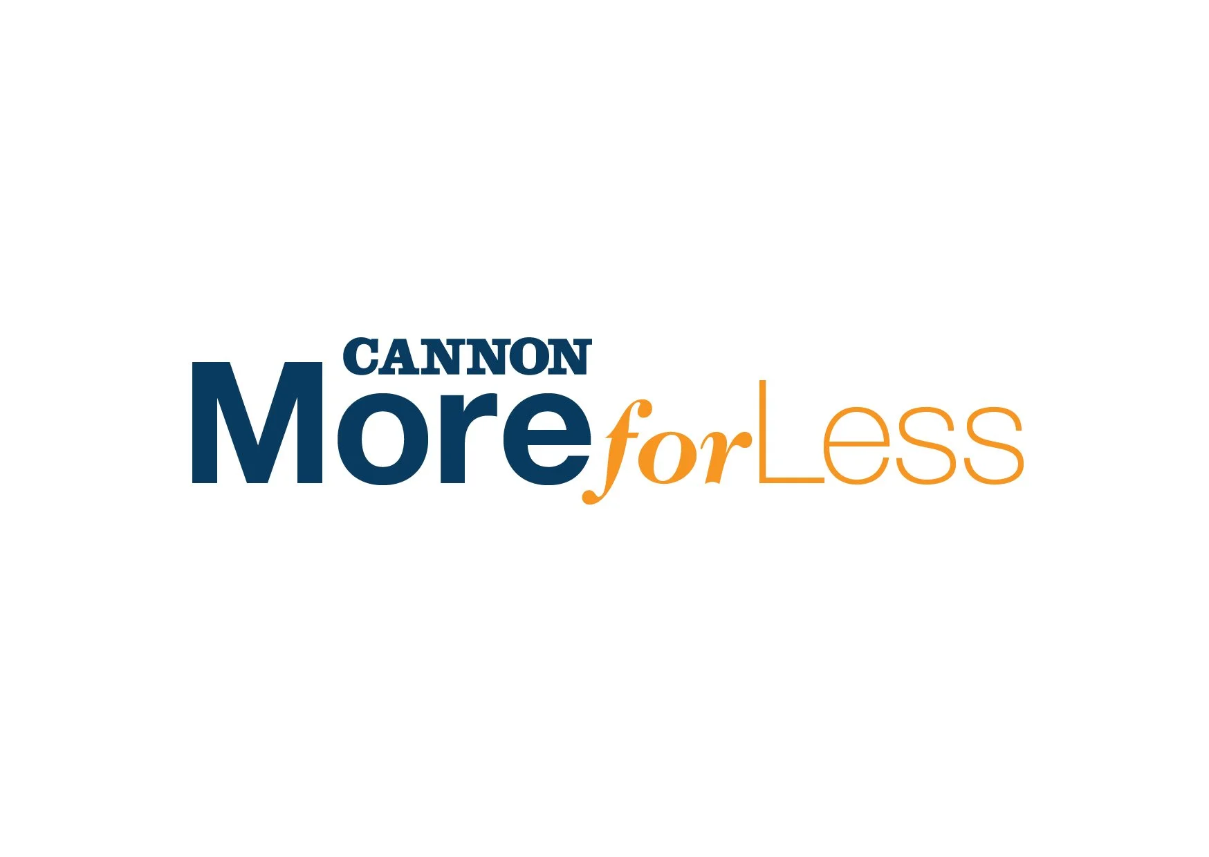
More for Less
Capturing the essence of value, this brandmark highlights Cannon’s dedication to providing premium-quality products at accessible prices. It resonates with customers seeking affordable luxury for their homes.
Clean Slate
Designed to evoke a sense of freshness and renewal, this logo emphasizes Cannon’s focus on crisp, clean designs and functional products that serve as the perfect foundation for any space.
Entrepreneurial collaboration event
Overview
In anticipation of the event bringing together vendors and entrepreneurs, three logo mark options have been developed. Each design reflects the core themes of the event: collaboration, networking, and awareness, capturing the essence of the gathering and its goals.
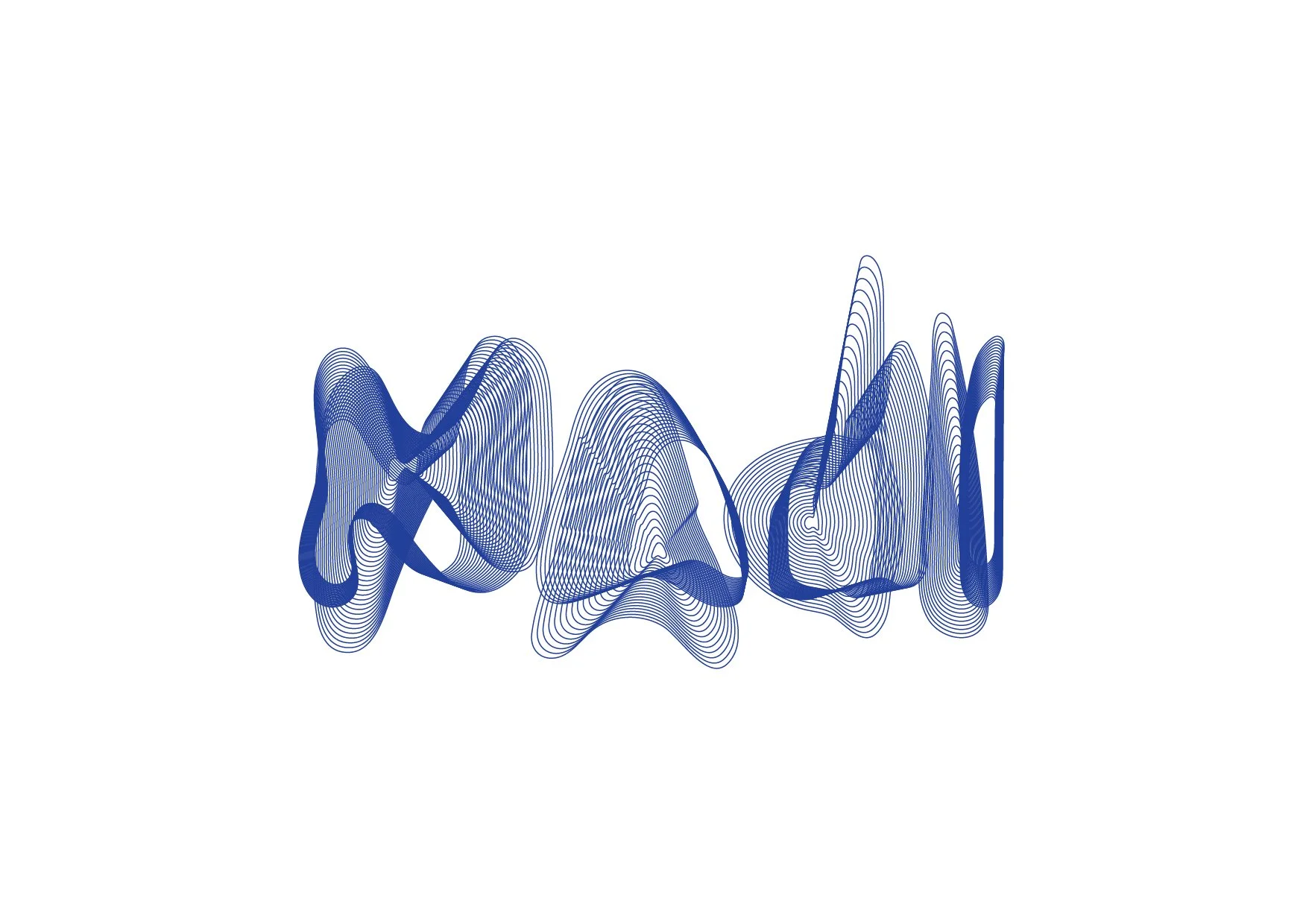
“NADI” = Pulse
This logo mark emphasizes the strength found in collective effort and partnership. Featuring interconnected elements, it visually represents the unity of diverse entrepreneurs and vendors coming together under one roof. The design conveys the idea that through collaboration, businesses can thrive, share knowledge, and build lasting relationships.
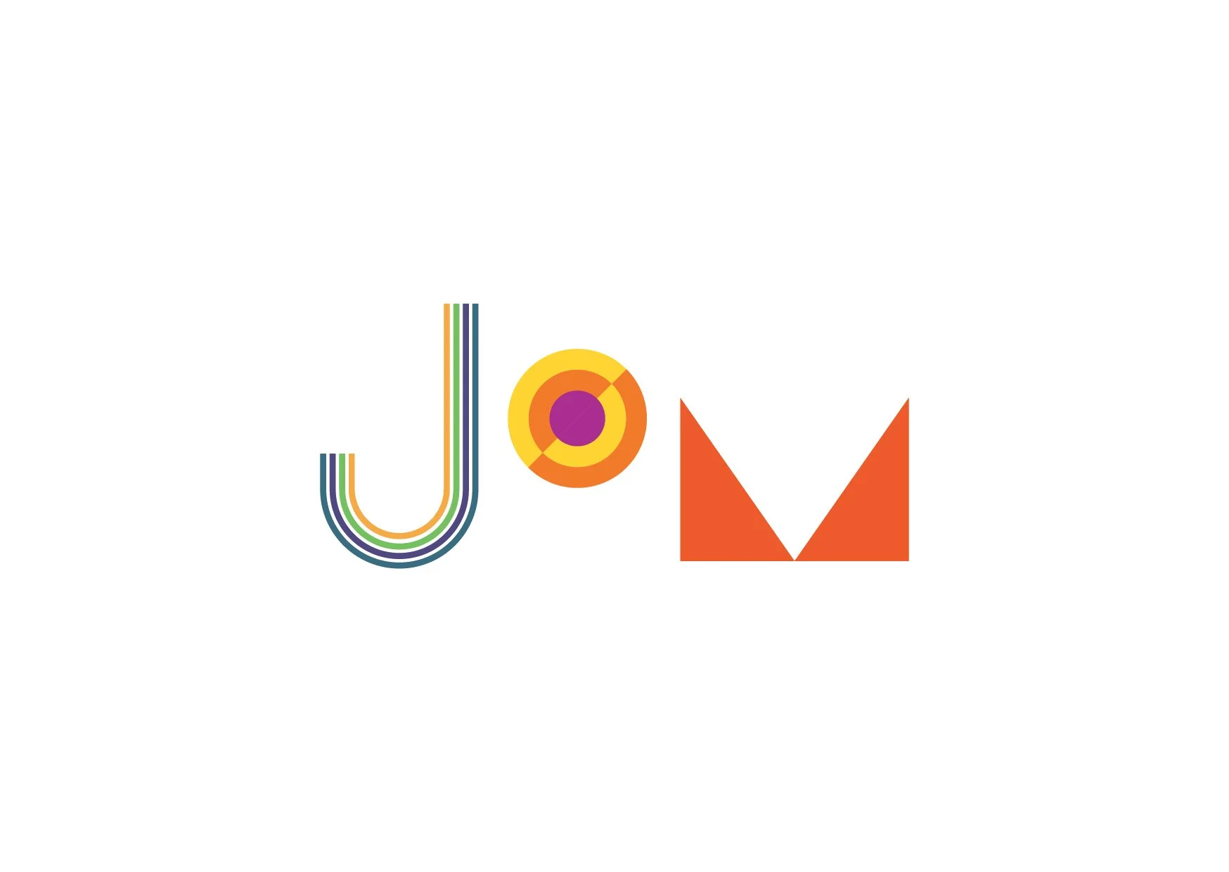
“JOM” = Let’s Go
This logo mark focuses on the event's primary objective: business growth through networking. Using geometric shapes the logo symbolizes upward momentum, progress, and the growth potential that comes with forming new connections. The inclusion of abstract shapes highlights the significance of networking and the connections that will empower attendees to expand their businesses.
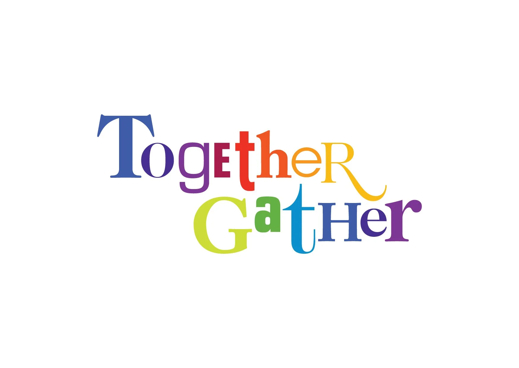
Together Gather
This logo mark uses a vibrant mix of different coloured alphabets to form the event name, symbolizing the visibility and awareness participants can gain through the event. This dynamic design reflects the opportunity for businesses to stand out, be recognized, and make a lasting impact. The use of bold typography emphasizes the event's role in amplifying the presence of vendors and entrepreneurs, offering a platform for exposure and connection with new audiences.
Metro
Store special event marks
Overview
These are are unique, commemorative designs created to celebrate significant milestones and events, enhancing the brand's identity during these key moments.
The Metro Travel Fair
The logo effectively captures the essence of a travel fair with a bold serif typeface for clear visibility and a circular layout surrounded by diverse travel icons. This emblem-like design communicates the excitement and variety of travel, positioning the event as a comprehensive and accessible destination for all types of travelers. The wide range of imagery emphasizes that the fair offers something for everyone, regardless of their travel preferences.
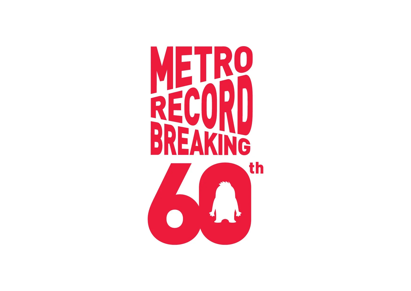
Metro Record Breaking 60th
The "METRO RECORD BREAKING 60th" logo features a bold, compressed Helvetica font with a dynamic slant, creating energy and movement. The slanted words form a box shape, symbolizing progression and excitement. The "60th" incorporates a monster silhouette within the '0', subtly nodding to the anniversary mascot. The logo is unified by Metro’s corporate red, reinforcing the brand identity while celebrating the milestone in a bold, modern way.
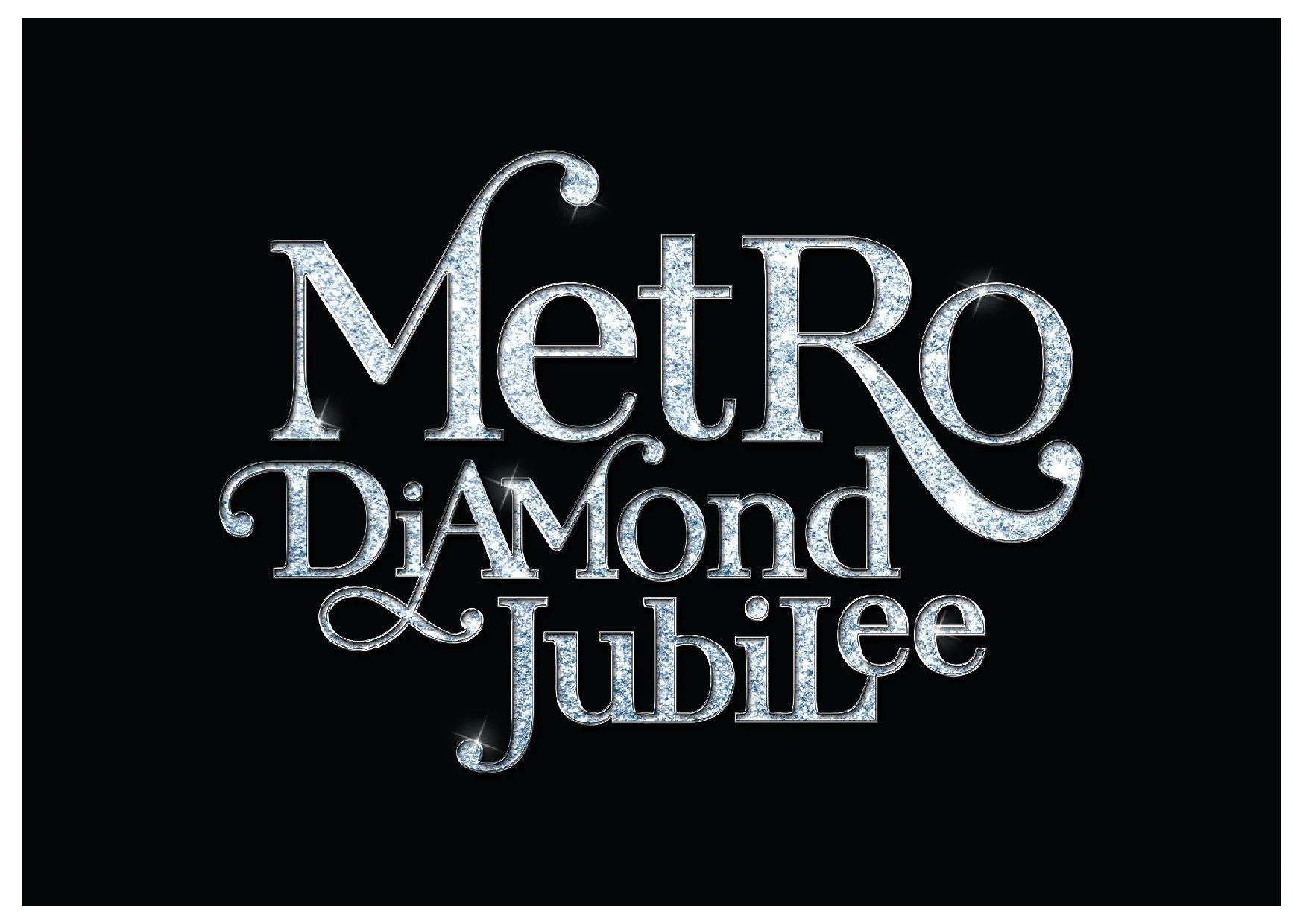
Metro Diamond Jubilee
The "METRO DIAMOND JUBILEE" logo features bold serif type, with the three words stacked in a structured layout and enclosed in a black rectangular background for strong focus. The text texture is filled with small diamonds, symbolizing the elegance and significance of the diamond jubilee, creating a fitting representation of this milestone event.

